Vancouver Park
Wayfinding System
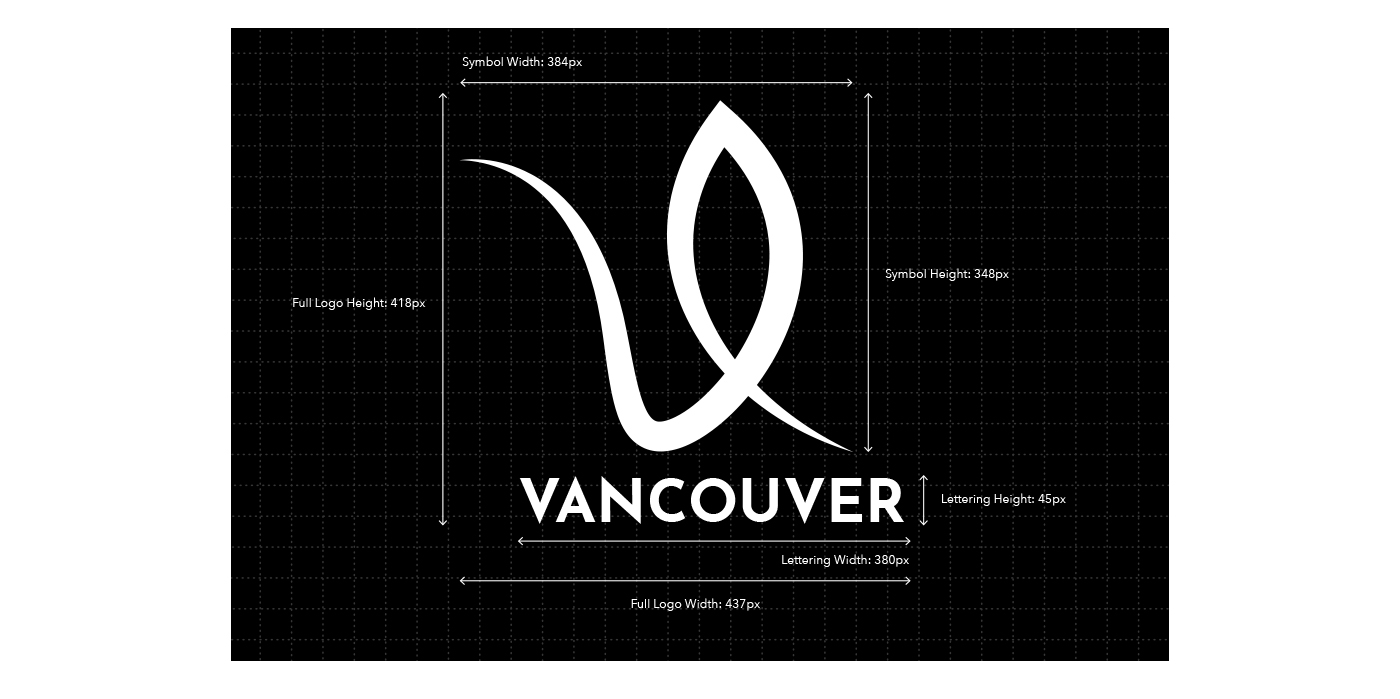
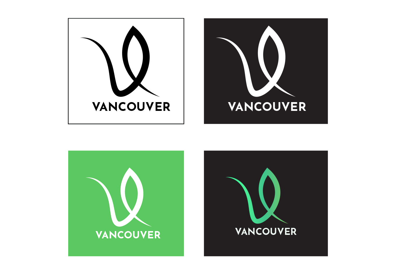
The city of Vancouver has a clean image and green city branding. The Official logo was built on the existing green identity and culture of the city with a leaf shaped logo design.
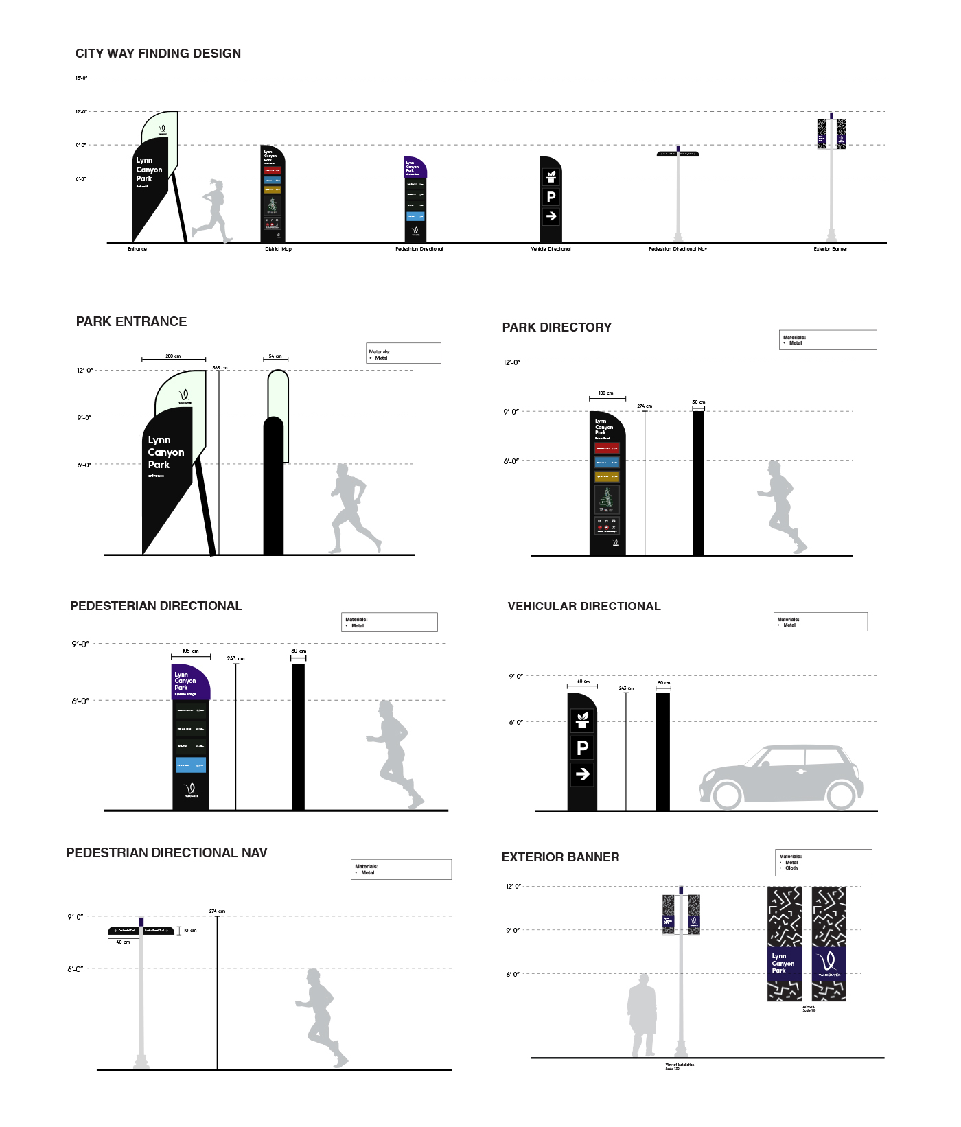
In the reflection of the city the wayfinding system was built on a leaf shaped theme
that was integrated into the wayfinding signs and directories. The whole system was then brought into an wayfinding app created for the District National Park of Vancouver.
that was integrated into the wayfinding signs and directories. The whole system was then brought into an wayfinding app created for the District National Park of Vancouver.
From concepts to logo ideas
The brainstorming process made it easier to generate logo ideas because the concept always stayed the same. Vancouver has a clean identity in terms of green culture because of its green city action plan. So for that reason it was a good choice to create a logo that would integrate with the already green city branding Vancouver has.
The final logo followed a leaf shaped figure to have a more natural feel and identity for Vancouver, with a sharp lettered word mark to create a contrast with the smooth logo. To further create an identity for the city the idea was to animate the insides of the logos with Vancouver inspired textures.
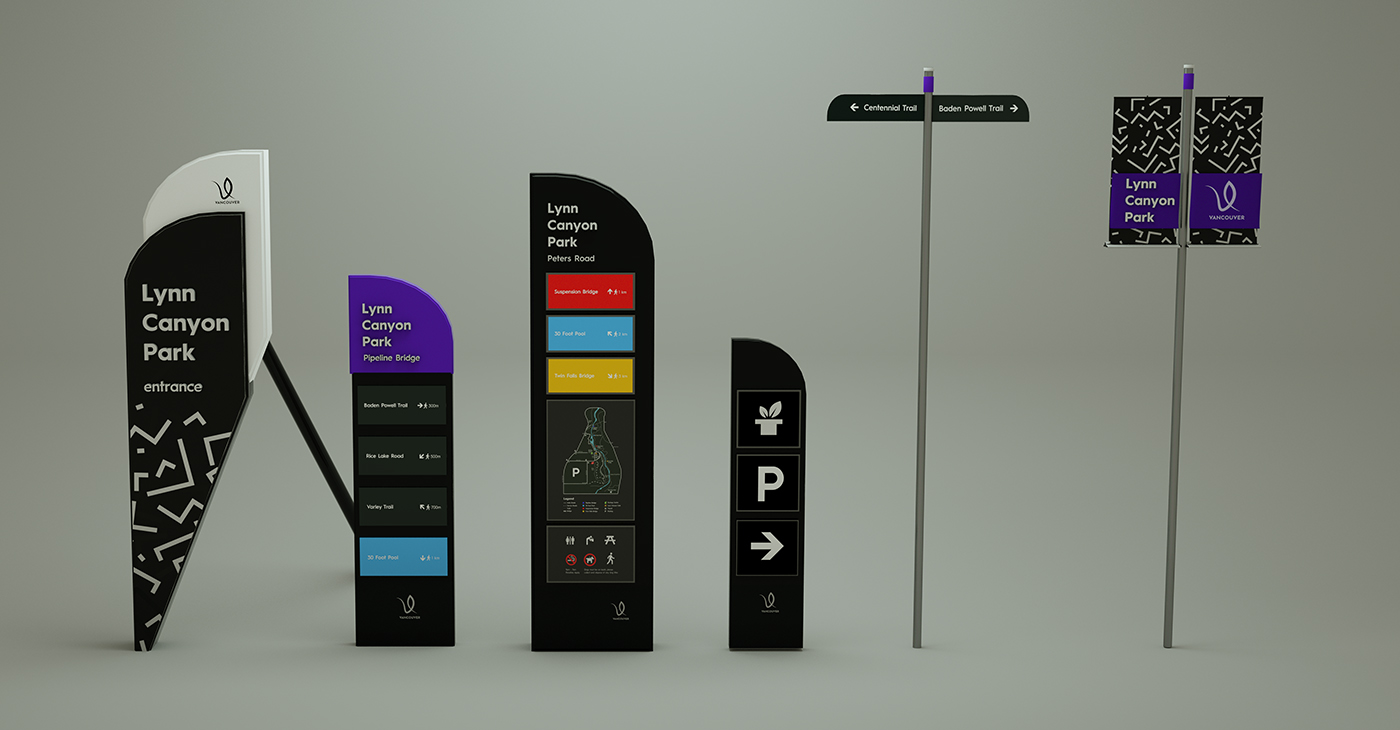
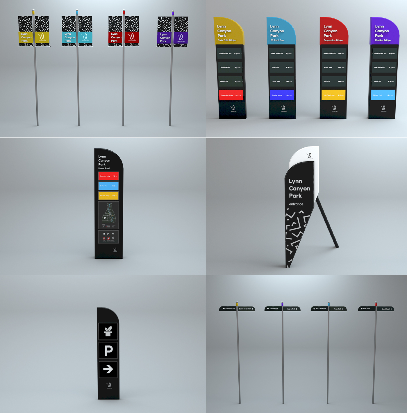
Creating a Wayfinding System
The way finding system followed the same concept used to create the Vancouver logo. Since the logo was created in a leaf shaped manner, the concept was the create a curvy way finding system to integrate with the green city branding of Vancouver.
It was important to follow the size and height guidelines for the city way finding system in order to create signs that are applicable to everybody including people that may be disabled.
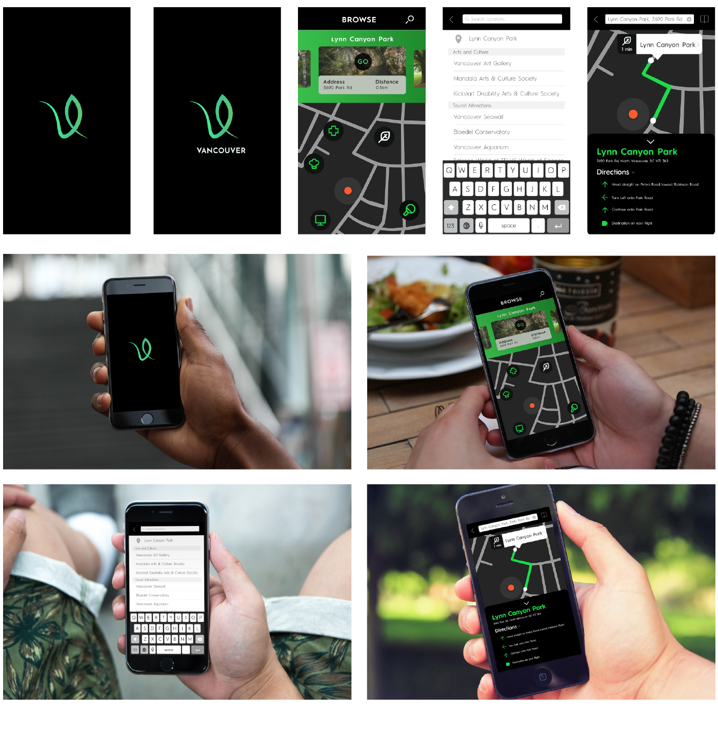
Wayfinding App
The way finding app is very simple, the user is able to determine where he wants to go by either using the search option or the map UI to either enter in locations or figuring it out by looking through the catalog of option ranging from Arts and Culture, Restaurants, Nightlife and Casinos, Shopping, Gardens, Tourist Attractions, Parks and Recreation, etc…